We earn a commission for products purchased through some links in this article.
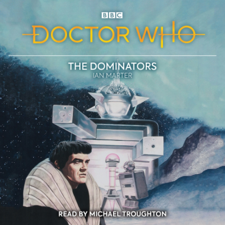
Doctor Who The Dominators 2nd Doctor Audio CD
Available to order from www.amazon.co.uk
Michael Troughton reads this gripping novelisation of a classic adventure for the Second Doctor.
The Doctor remembers Dulkis as a civilised and peaceful place. But times have changed, and his second visit is not quite the holiday he was expecting.
When the whole planet and its inhabitants are threatened with annihilation by an alien race, the pacifist Dulcians are more reluctant than ever to engage in acts of violence. None of them will lift a finger to fight the Dominators and their robot slaves, the Quarks.
The Doctor, Jamie and Zoe may be the only ones capable of intervening to save the whole planet.


 The Doctor Who Site
 Facebook
 Twitter
 Pinterest
 Merchandise
 Flickr
 YouTube
Prof Horner
April 11th, 2018 - 11:41amNice to see that Michael Troughton is reading this story.
John Baker
April 10th, 2018 - 5:00pmUse reversible covers
PLEASE
Consistency is Important for collectors
Classic 1996 / 1970 or 1974
New: the current logo
Peddonally just use the logo from that era for new ranges and keep the old for the existing
Captain Kronk
April 6th, 2018 - 9:45pmIt’s a shame that they ditched the classic logo completely. The new logo just doesn’t suit the classic who merchandise.
Anonymous
April 6th, 2018 - 6:13pmCover will be reversible anyway with old logo on other side.
booboo
April 6th, 2018 - 6:31pmif that’s true dont understand why its not a selling point for those “sitting on the fence” – same as the classic DVD’s
consistency is important to many collectors.
as far as i’m aware it was never officially said enemy of the world had a reversible cover
The Surgeon
April 5th, 2018 - 4:20pmThat’s a really weird picture but the logo looks great, again. Picture makes it look like the Quarks are the Dominators though
cyberman12
April 5th, 2018 - 1:11pmNew logo not good why change?
bryan
April 5th, 2018 - 1:31pmI think its been mentioned here and eleswhere.
The New Logo is to be used over ALL merchandise ,to bring the Branding into a more Cohiesive platform.
lots of stuff had different logos on, or branding Designs,so move to One logo for all, all for one logo.
I think its a great logo, and suits some ranges bestter than other, but it is what it is. A new era,New Logo, . its happened before.
Nuallain
April 5th, 2018 - 2:38pmFor the same that they originally changed to using the 1996 logo on the audiobooks range instead of the 1974 logo – because it’s the *current* one.
bryan
April 5th, 2018 - 12:12pmooh, That looks very nice. Some of these Covers ,can look a bit awkward with the edges extended, but the Change to the new Logo, means both this and The Mutants benefit from a little extra height space.